Code and Data

Code and Data looks at different types of data and graphs. A numeric data set is formatted first and then displayed through code. Three types of graphs are addressed here: Line, Bar and Donut graph.
3 Graphs
For this exploration, we decided to extract data from the 2020 Tokyo Olympics and present the number of medals won by the different participating countries. We first explored with the bar graph as we felt that this was best appropriated for the data we are trying to visualise. We also explored using donut graph for this data visualisation.
Bar
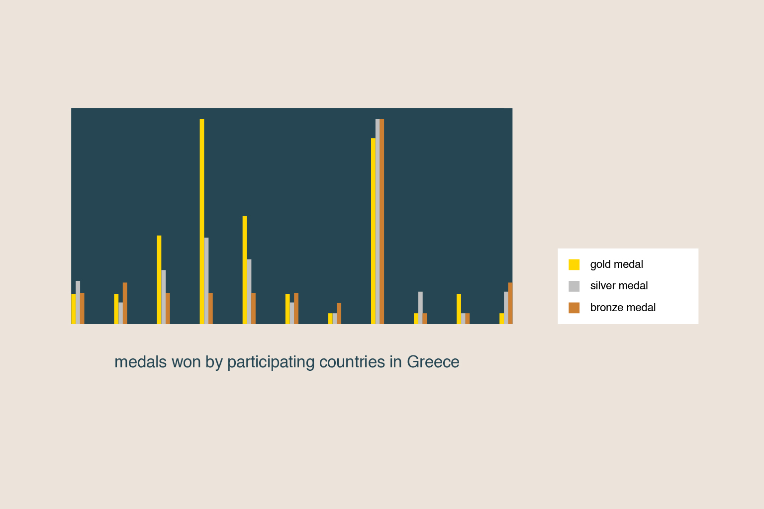
Based on the data we have extracted, we categorised the number of medals won by the participating countries according to their types; gold, silver and bronze. Other than using colours to represent the types, we explored the use of legends for further aid in clarity.
Donut
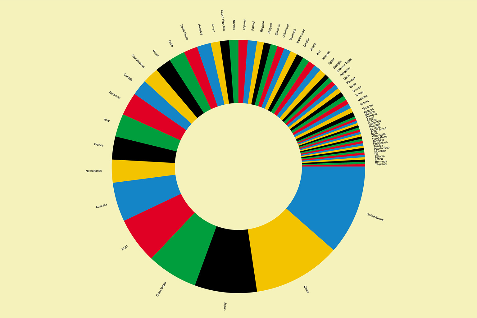
For the exploration of the donut graph, we extracted the data indicating the number of medals won (not according to type) by the participating countries for the 2020 Tokyo Olympics. We think that the donut graph is visually appealing, but in terms of visualising data, it is not very accurate as it is hard to infer comparisons and get insights from a donut graph, especially of one that consists of a lot of data. We think that specifically for the data we extracted, a bar graph would best fit this data representation.
Overall, we think that the type of graph we use is really important in relation to the type of data we are trying to visualise. It is not always about how visually pleasing it is (although that is a bonus) but more about how well the type of graph chosen communicates the data.
Your Data Graph
Based on the datasets we were provided, we decided the extract the data for the number of gold, silver and bronze medals won by the participating countries for the 2020 Tokyo Olympics. We decided that the bar graph is best for the visualisation of this data.
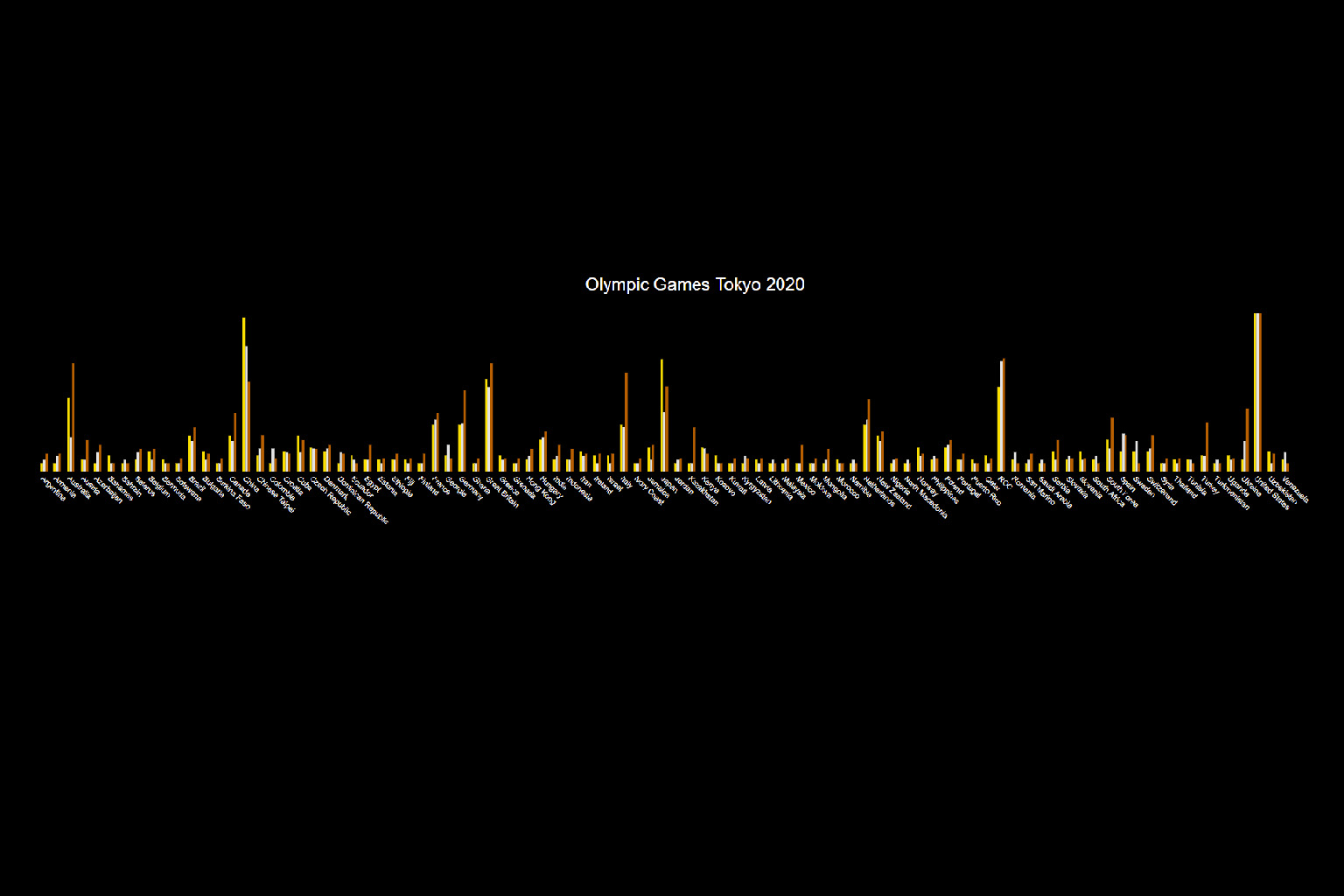
From the graph above we can observe the stark differences in the medals won between the different participating countries for the Tokyo Olympics 2020. Perhaps this is an indication of which countries have (objectively) better athletes.
Below you can find an excerpt from the data we have used. Based on a data set on Climate Change recorded since 1896, we have extracted the following data points that we have worked with:
| Countries | No. of medals won |
|---|---|
| United States | (G) 39 (S) 41 (B) 33 |
| China | (G) 38 (S) 32 (B) 18 |
| Russian Olympic Committee | (G) 20 (S) 28 (B) 23 |
| Australia | (G) 17 (S) 7 (B) 22 |
Data Interpretation
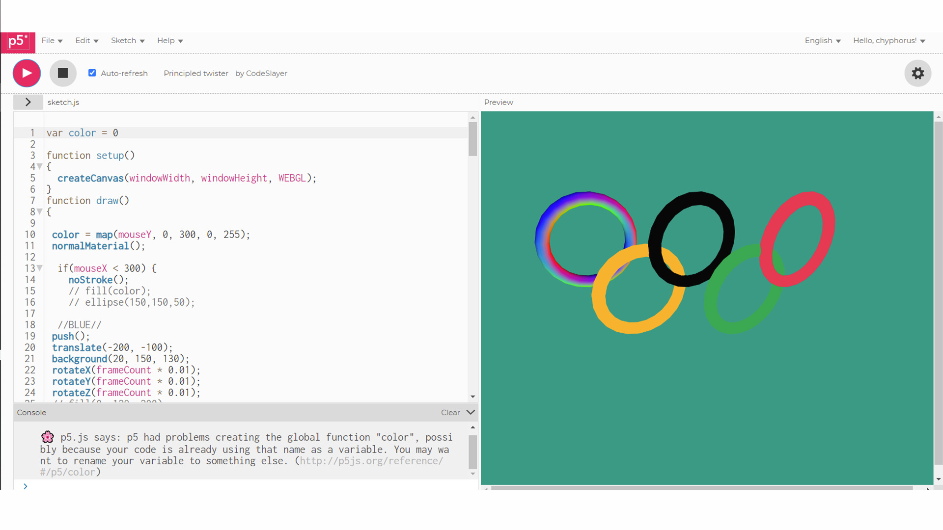
For this activity, we definitely wanted to do a sketch that is more interactive and focuses a little more on the aesthetics aspect. The overall intention of this sketch is to keep the viewers' eyes on the screen through motion and interaction.
